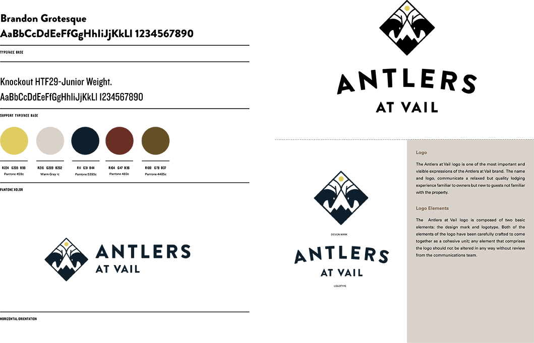
Reimagining a classic mainstay of the Vail resort scene

Rebranding Antlers at Vail

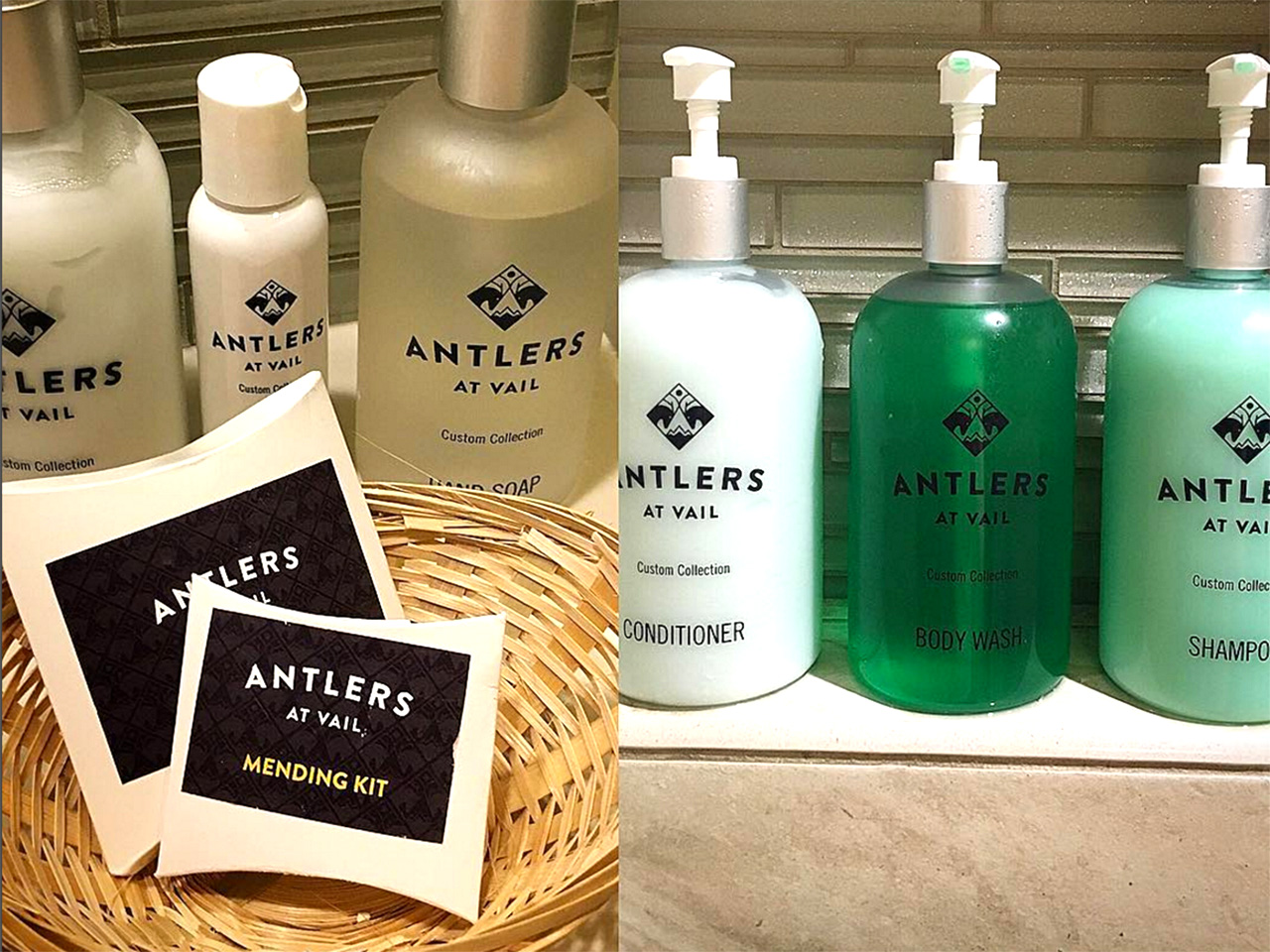
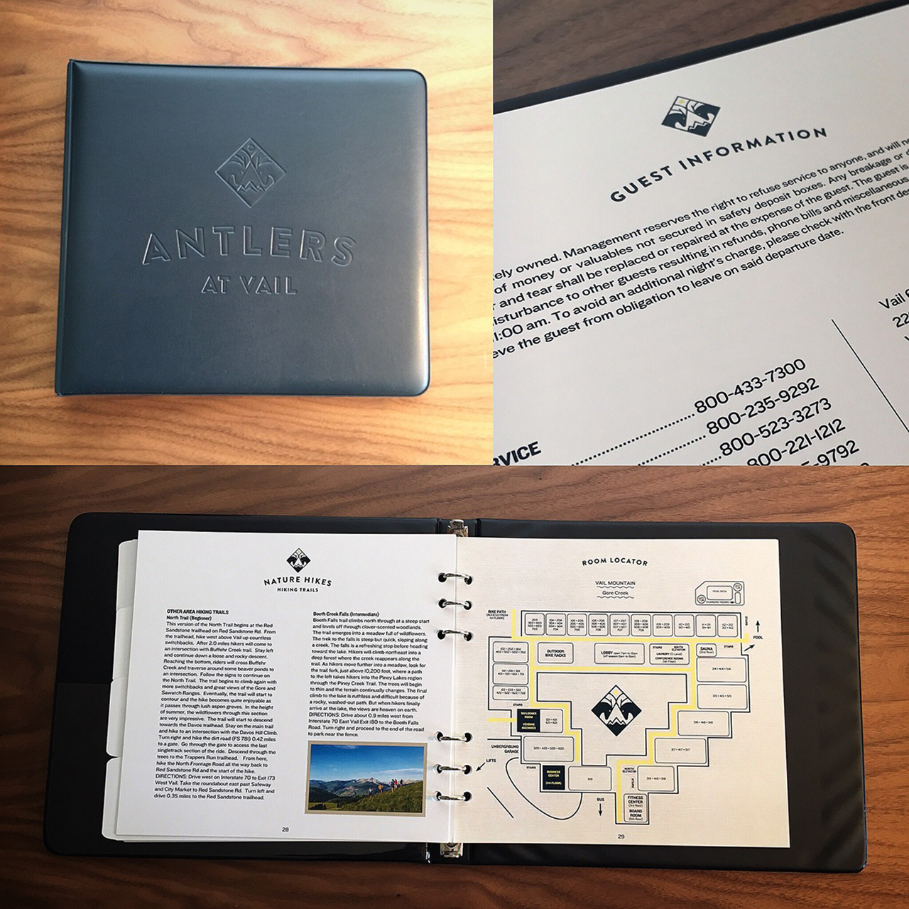
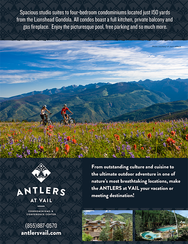
Antlers at Vail asked Wigwam Creative to help rebrand their slope-side resort along with an effort to improve the rooms to platinum status. A new brand, signage, collateral, and other elements helped condo-owners to visualize the update and encouraged them to put money into room refreshes resulting in the highest platinum status level in Vail.


“Our logo and corporate identity was 40 years old, and as comfortable as we were with it – too comfortable, probably – as we began to see the amazing results of our Unit Quality Improvement plan moving us toward becoming an overall Platinum-rated property, we realized it was time for a new logo and visual brand to represent the new Antlers,” says Antlers GM Rob LeVine. “Both because of our name and our well-known courtyard sculpture, we felt it was important to keep the elk and antlers as part of our logo. Plus, we wanted to convey that although we look better, our values remain the same, emphasizing our ‘the answer is yes, now what is the question’ approach to customer service, our family feel and our strong role as a community partner.